

- Posted on
- Michael Miller
Beautiful Presentations for Your Website: Design-Led Storytelling That Converts
Your website is more than a digital address — it’s your first impression, your best pitch, and your most consistent sales rep. In 2025, how you present your brand online determines how you’re perceived. A clean layout, purposeful motion, and visually coherent storytelling are no longer “nice to have.” They’re expectations. And the gap between websites that meet that standard and those that don’t? It’s costing brands traffic, trust, and conversions.
At EMMGS, we approach every website like a performance. Not in the theatrical sense, but in the way every design decision — from typography to scroll behavior — communicates credibility. A beautiful presentation isn’t just a design flex; it’s a strategic tool for deeper engagement, stronger retention, and more meaningful conversions.
Design-First UX: Why Presentation is Now Performance
User experience and presentation are now tightly linked. When someone lands on your site, they’re not reading yet — they’re scanning, judging, and feeling. The look, flow, and structure of your website influence whether a visitor stays to explore or bounces in seconds. That’s why thoughtful presentation is no longer cosmetic — it’s foundational.
Design-first UX means every element serves a purpose. Layouts must prioritize clarity, visuals must align with message, and the entire structure needs to reduce friction. A scattered or templated layout gives the impression of a scattered or templated brand. Conversely, a beautiful, intuitive site design signals authority, effort, and polish — all before a single word is read.
Structure Is the New Sexy: Telling a Visual Story
Effective presentations follow a rhythm. Much like a great slide deck, your website should guide users through a well-paced story. That means defining a beginning (your promise), a middle (your proof), and an end (your call to action). It’s not just about putting content on a page — it’s about orchestrating how someone experiences that content.
We help brands move beyond static headers and blocks of copy. With intentional spacing, scannable sections, and visual anchors (like icons, pull quotes, and animations), we ensure users stay engaged from scroll to scroll. Great presentation means no dead zones, no confusion — just a fluid journey that makes your offer irresistible.
Visual Hierarchy and Typography That Works
If everything speaks at once, nothing gets heard. That’s why visual hierarchy is at the core of presentation design. The goal is to guide the user’s attention — using scale, color, spacing, and contrast — so they intuitively know what to focus on next. Done right, your key message pops while the supporting content supports without distraction.
Typography plays a major role here. The right font system adds tone and rhythm. It makes reading effortless and turns even dense information into elegant, digestible sections. We work with modern type systems that are mobile-optimized and brand-specific, using contrast between headline and body styles to deliver both clarity and character.
Micro-Interactions and Motion that Elevate UX
Today’s web users expect movement — not overwhelming animations, but subtle, thoughtful motion that adds feedback, guides actions, and enhances storytelling. Scroll-based reveals, hover states, and transitional animations can turn a flat experience into an immersive one.
We use tools like Framer Motion and GSAP to craft fluid transitions that draw attention without stealing focus. Micro-interactions help users feel in control — like a button that responds when clicked, or a form that animates on completion. These aren’t gimmicks. They’re essential for a site that feels modern, polished, and alive.
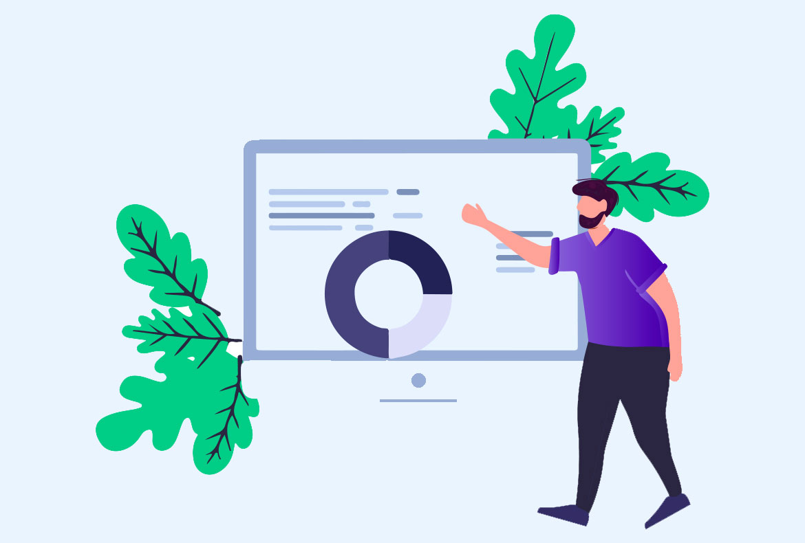
Data, Design, and Presenting Your Value
In many industries, your value proposition comes down to data — numbers, growth, impact. But raw numbers alone don’t sell. Presentation transforms metrics into meaning. Beautiful data visualization helps prospects see your value. Whether it’s animated stats, interactive dashboards, or infographic sections, we build visual proof that resonates.
We’ve found that the best presentations pair logic and emotion. Data builds credibility, and great design makes it digestible. Especially for B2B brands, a clear visual narrative around results — supported by case studies, testimonials, and interactive proof — turns abstract value into real-world impact.
The Role of Interactive Presentation in Conversion
Users want to engage. Interactive site elements — from quizzes and sliders to scroll-triggered animations — give users a sense of control and involvement. This increases time on page, builds connection, and moves them closer to action. And thanks to today’s tools, this level of interactivity doesn’t require complex dev work.
At EMMGS, we often use Webflow and React-based frameworks to create modular interactive layouts that scale. Want a pitch deck embedded in your site? A testimonial carousel that responds to behavior? A live cost estimator? These aren’t just features. They’re conversion tools disguised as design flourishes — and they work.
Branding Through Presentation
Visual storytelling isn’t separate from branding — it is branding. How your site looks, flows, and behaves defines how your brand feels to your audience. When we design presentations, we’re not just decorating a site — we’re crafting an experience that reflects your tone, values, and voice.
This is especially important for challenger brands and service-based businesses. You may not have the scale of an enterprise competitor, but a well-designed site levels the playing field. In many cases, it wins the game outright. A beautiful presentation says, we care about the details. It builds the kind of trust that text alone can’t.
Final Thoughts: The Presentation Layer is Your Edge
If your content is gold, the presentation is the case you display it in. In 2025, the best websites aren’t always the loudest — they’re the clearest, the smoothest, the most intentional. A beautiful presentation earns attention and keeps it. And in a world where users decide in three seconds or less whether to stay or bounce, that’s your edge.
At EMMGS, we don’t just build websites — we craft brand performances. From site architecture to animation rhythm, we help you turn your message into a movement. Whether you’re refreshing your brand, launching a new product, or just tired of looking like everyone else — let’s create a site that makes people stop, scroll, and take action.